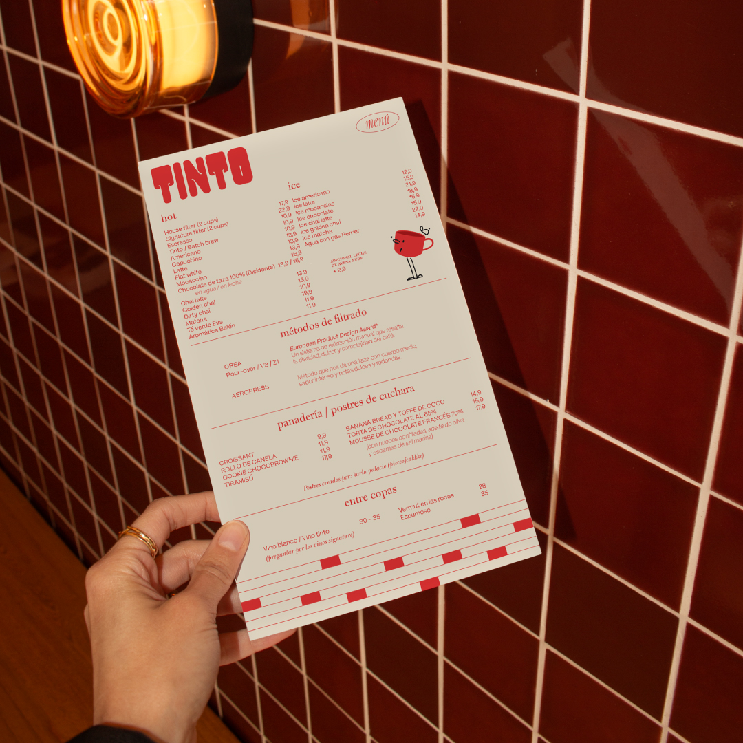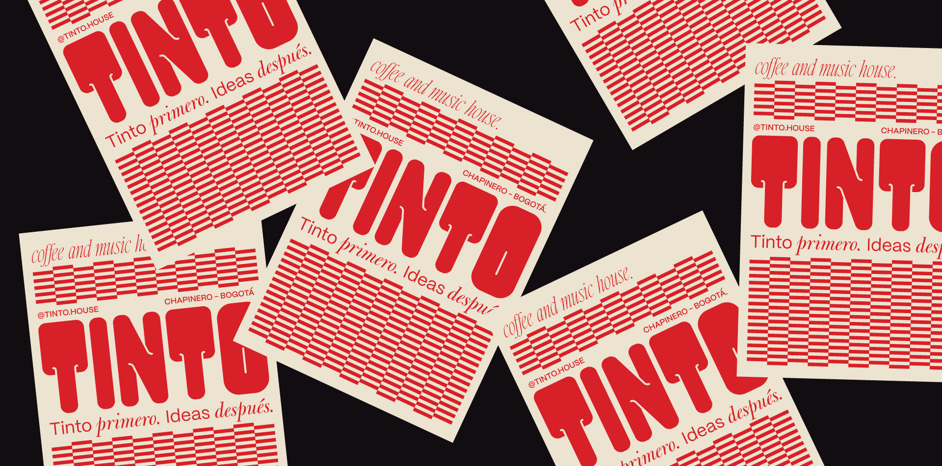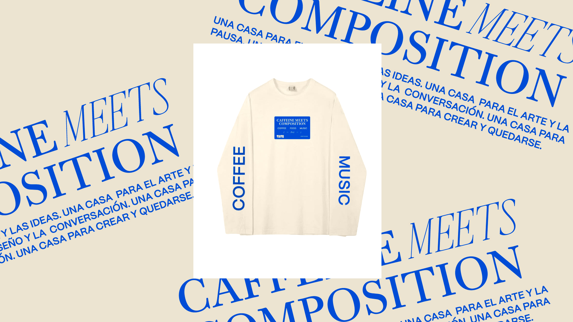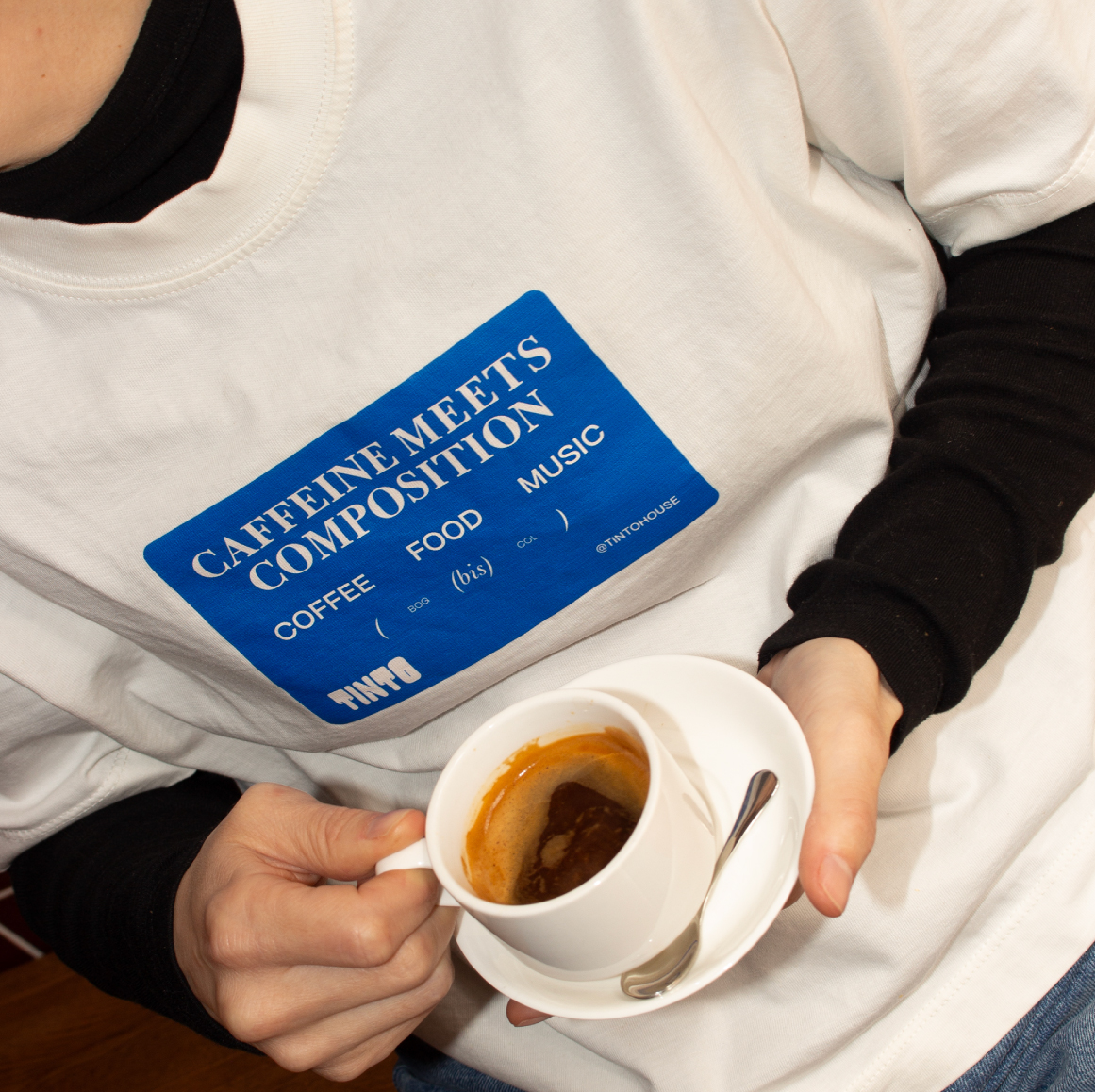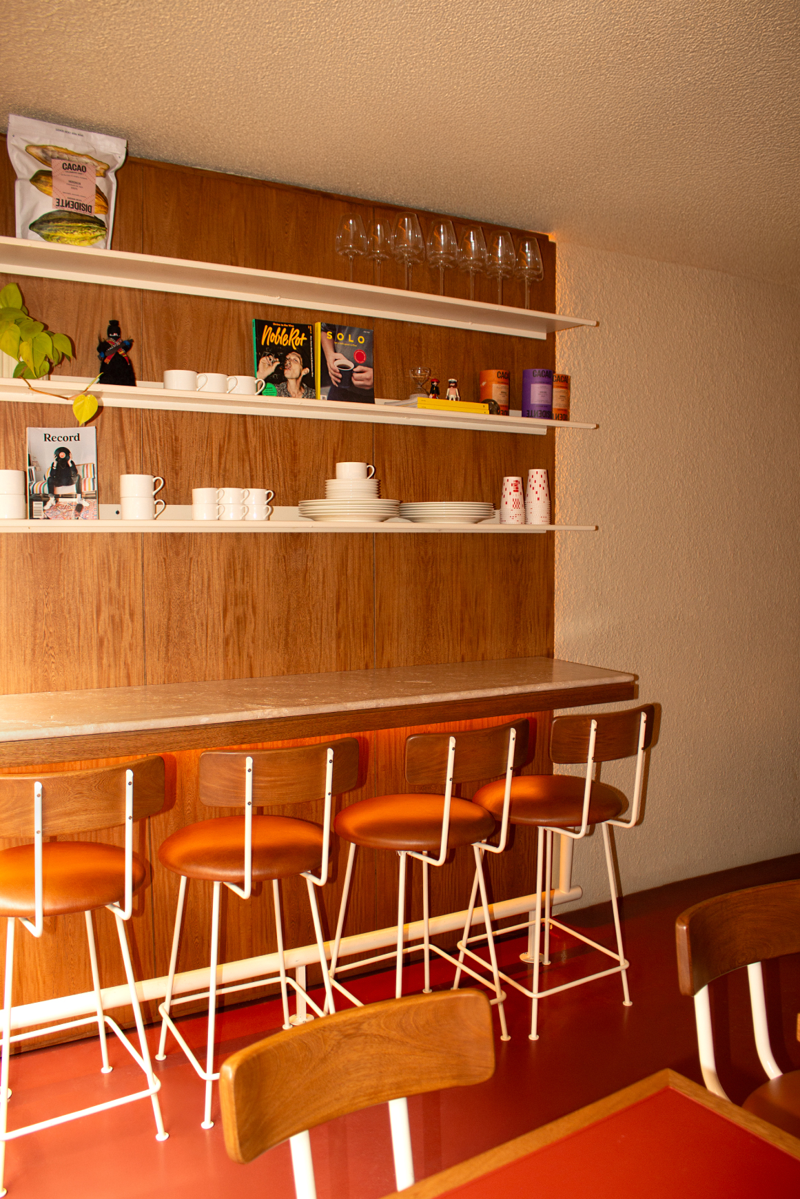
Tinto came to us with an established logo and color palette, but without a cohesive identity system to unify all of its brand touchpoints. Building on the brand’s attributes and the architecture of the space, where deep wine-colored tiles and warm lighting define the atmosphere, we developed a series of graphic elements that shape a personality that feels bold, welcoming, and effortlessly cool.
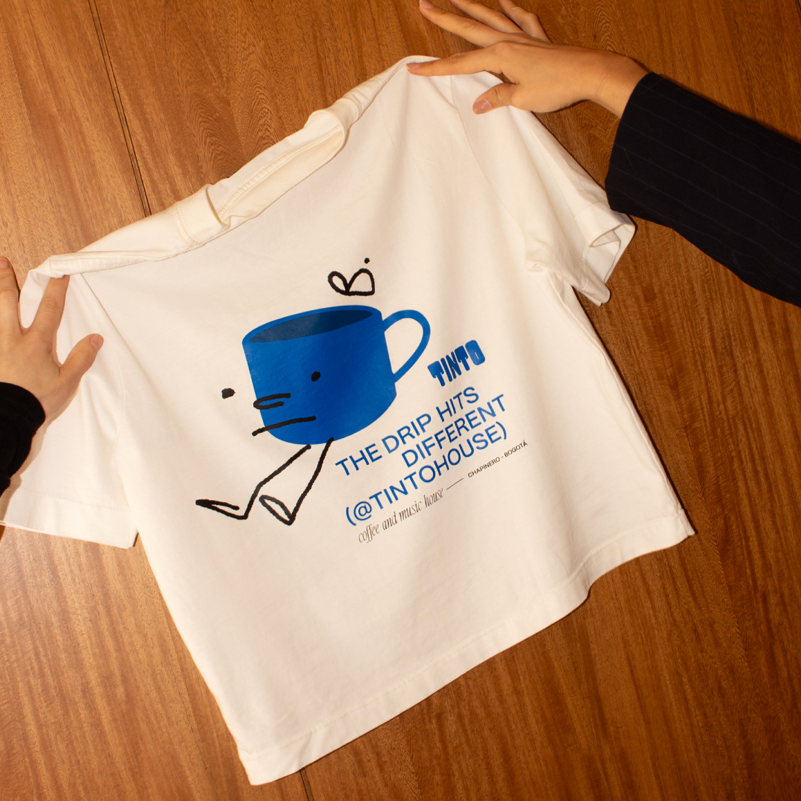
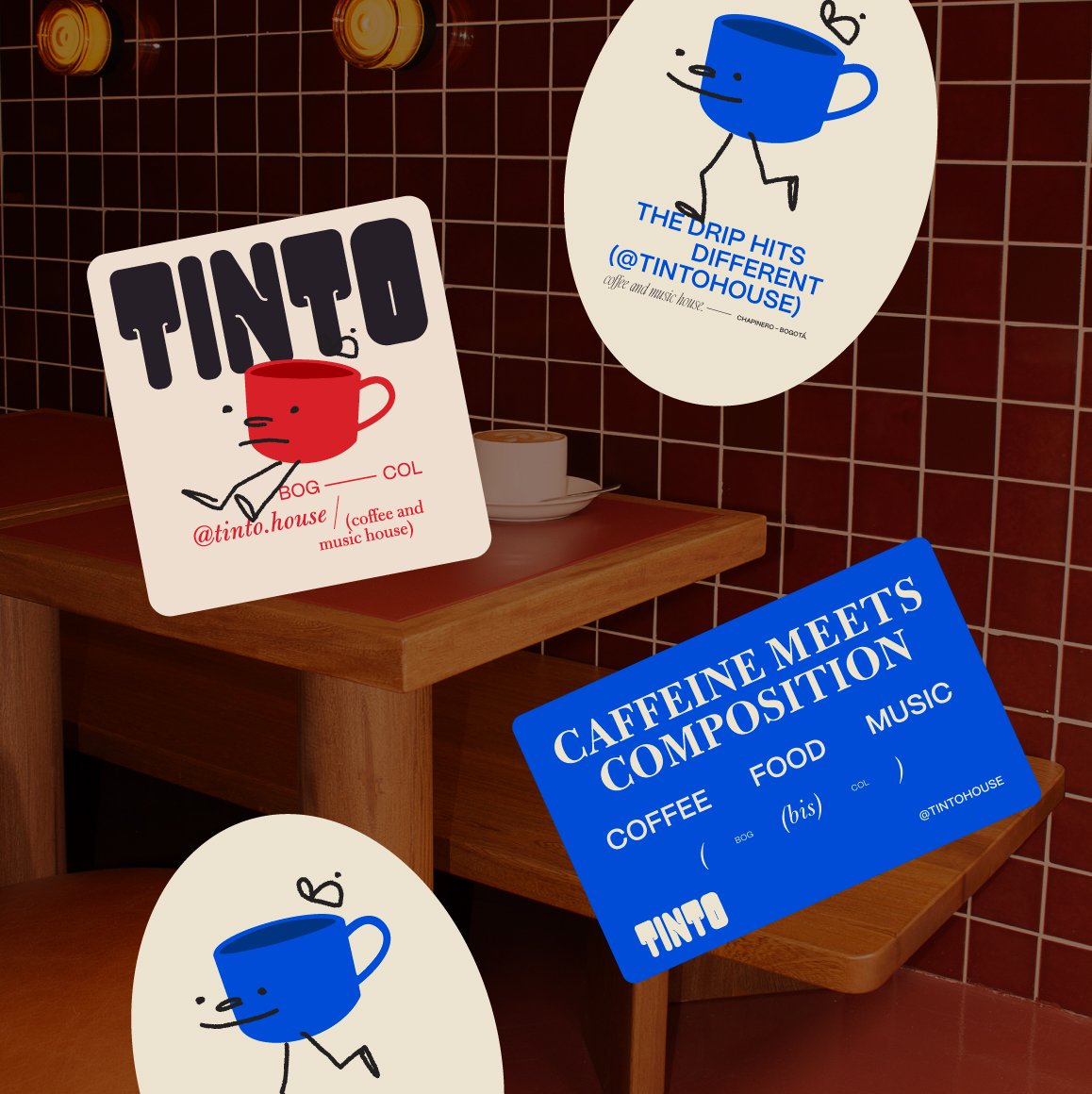
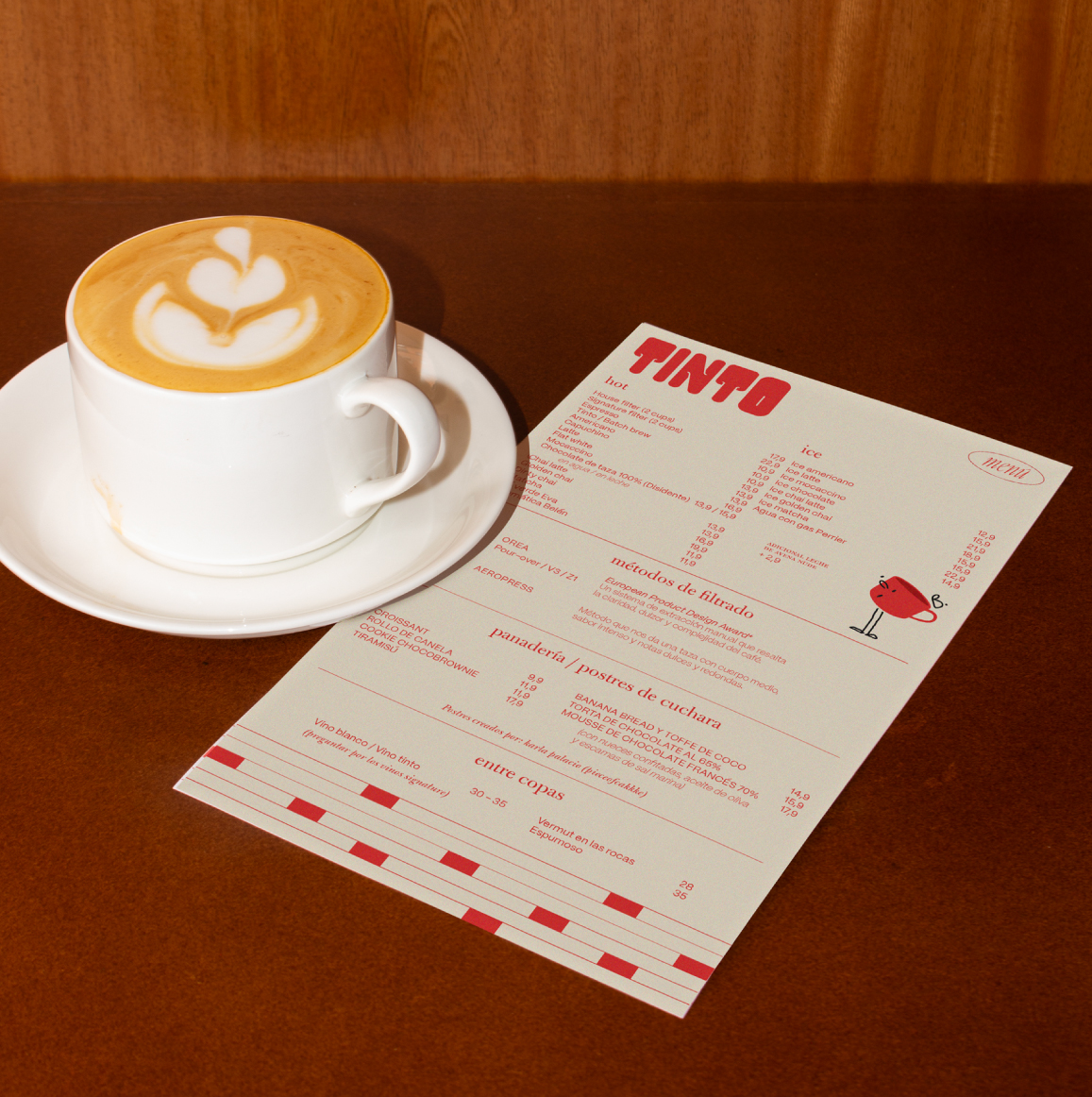
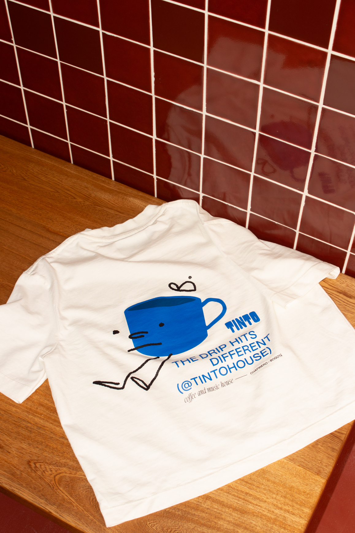
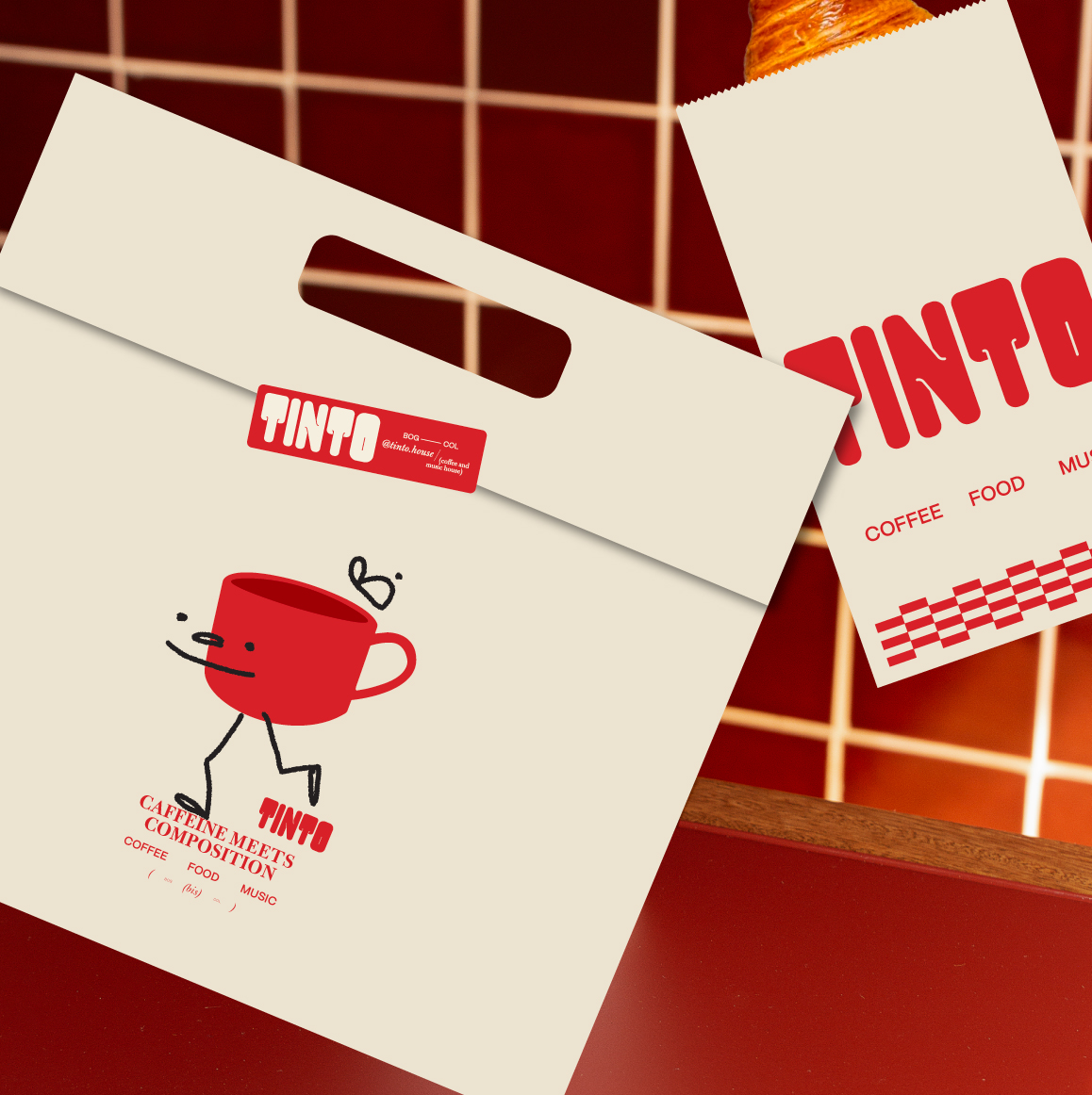
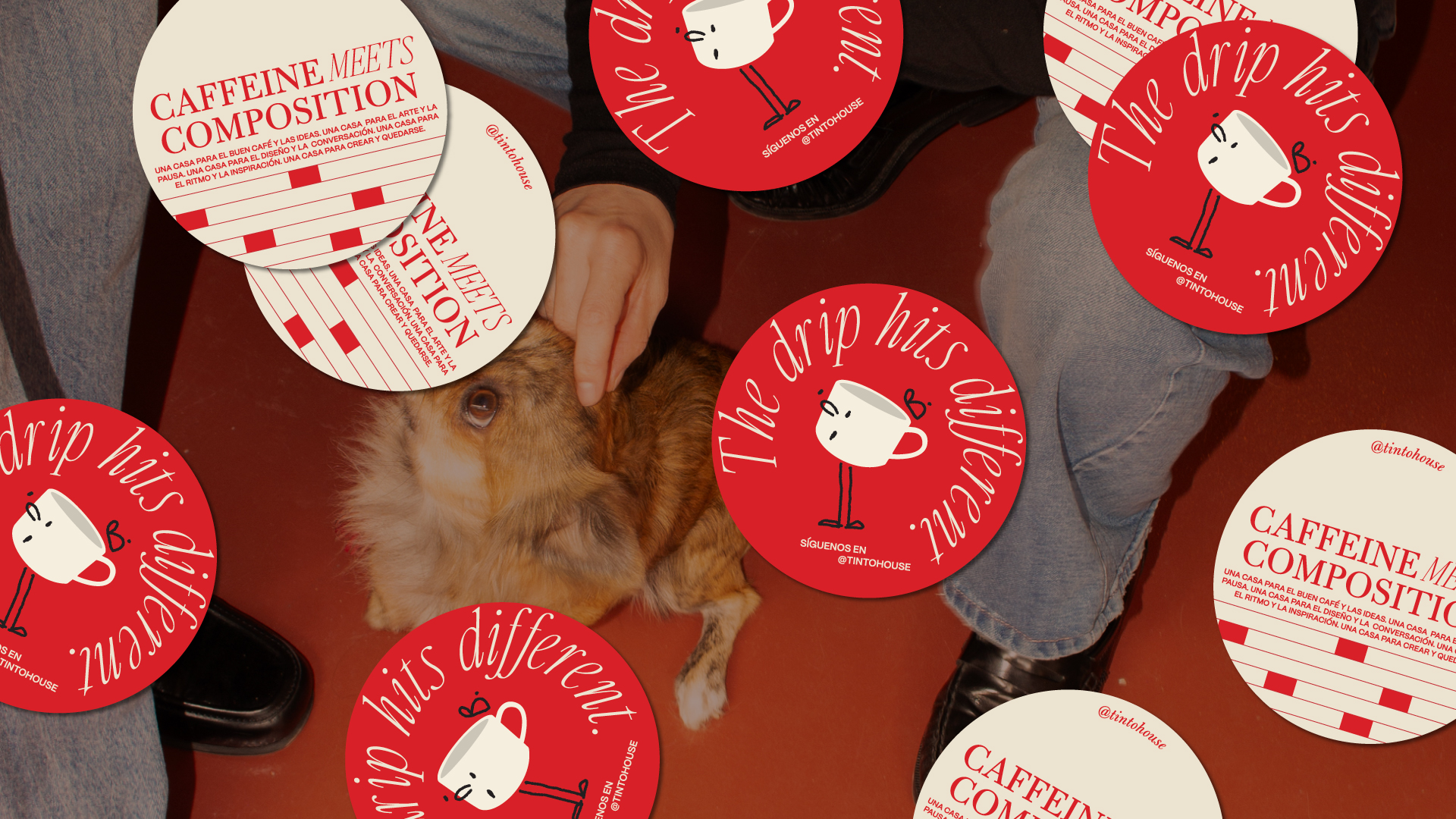
We started with a simple yet memorable gesture: a cup of tinto with friendly expressions that becomes a character capable of representing the brand’s approachable spirit. From there, we designed an identity system inspired by a reinterpretation of traditional restaurant placemat graphics, bringing a classic and warm character that dialogues with a more contemporary layout and the funky logo already present in the visual universe.
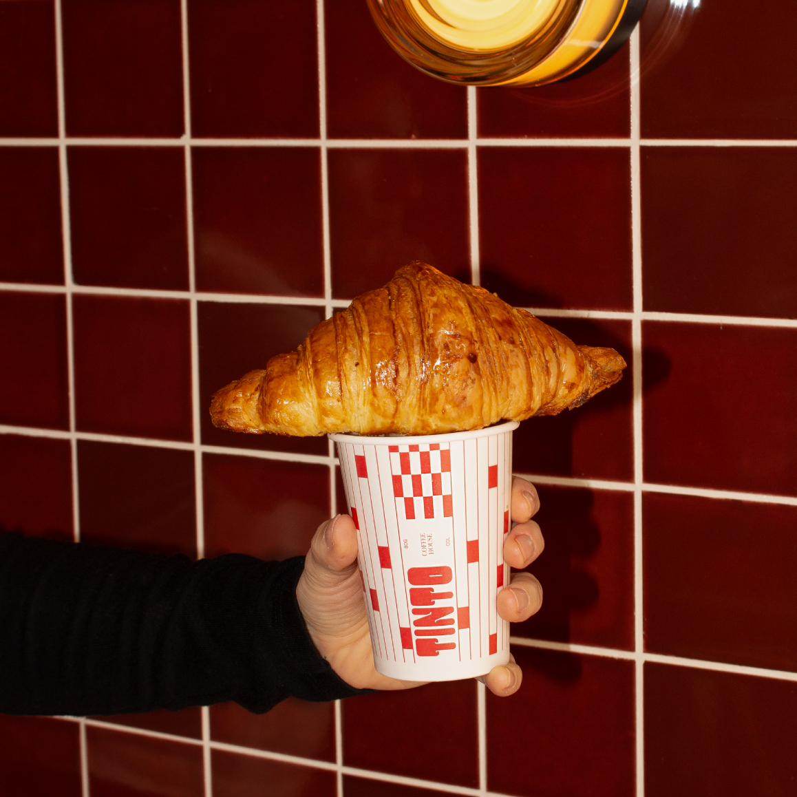
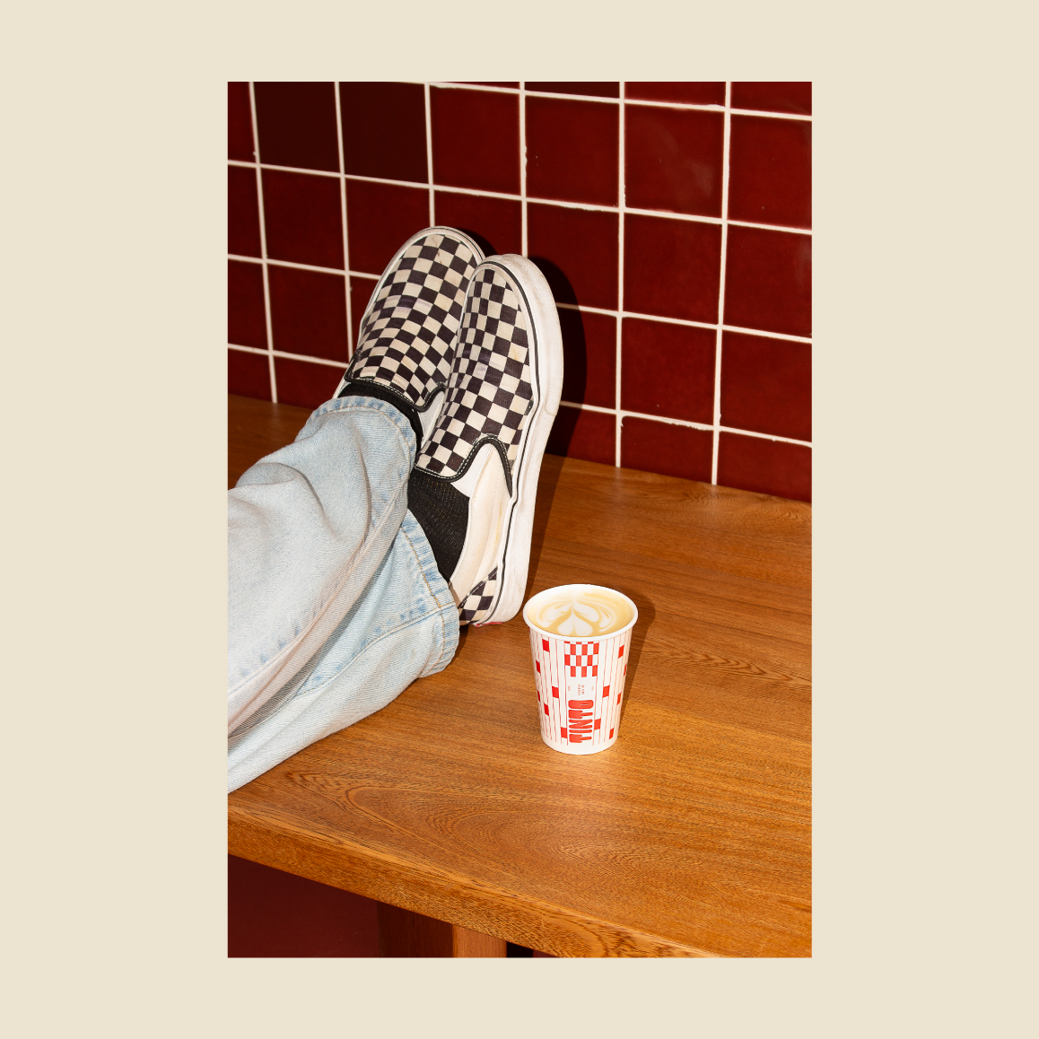
We also developed a series of copy lines that communicate Tinto’s value proposition: a place where every detail is carefully curated—from the music, finishes, and lighting to what matters most: serving some of the city’s best specialty coffee.